The Reduction Technique
- Sophie Scharer
- Sep 23, 2017
- 3 min read
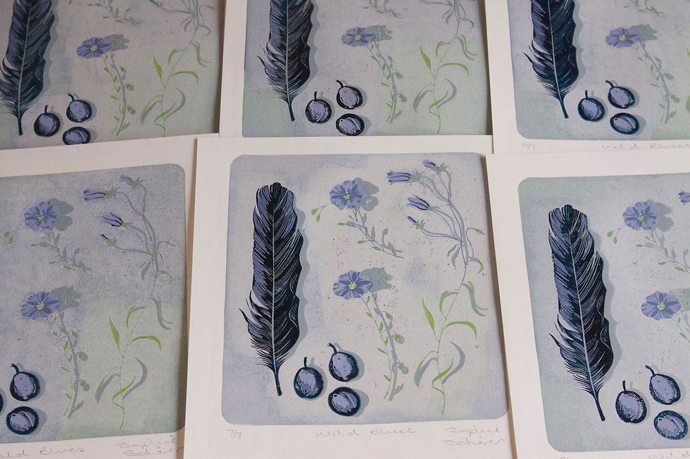
Visitors to my studio often ask me about the reduction Linocut technique and it can be a little difficult to explain without images, so below are a few of the stages to illustrate the evolution of Wild Blues, my newest reduction print. The method works by cutting and printing the same block in successive diminishing layers, working mainly from light to dark. At the end of the process the block is reduced to the final darkest elements and so is eventually destroyed. It is such a fun, challenging technique and needs some brain gymnastics at times to work out what to cut away and when, and which colours and tones will work well together in the final printed image. You are of course also working on the image in reverse. This print has seven layers, two greens, two blues, a silver grey for the background, a darker grey for the shadows and a final dark blue black. It started out as an edition of eight but became seven when I took the risk of printing while the ink was still tacky and lifted the surface of the first print - oh well, that will teach me to be more patient! Seven layers of ink, seven blue objects illustrated and in the end, seven prints.

The image above shows my guide drawing on the Lino as I begin cutting, I'm also working from a coloured drawing of the gathered blues, and this guides me when I decide what to cut away and where to add line, pattern and texture. In the image below I have cut away the white, the two green (stems and leaves) and the first blue colour and I am inking up the areas that will be the second darker blue.

Below, the printed image starts to emerge as the above block is printed over the first three colours - most of this will disappear under later layers of ink. Now as I cut away all the second blue and add the background, my challenge is to use the right amount of ink, not too much, so that I don't lose those fine stems.

Here the prints are drying in my studio, with four layers of colour.

Below is the inked up block after the second blue was removed, this is a silvery grey and will cover all the earlier ink, apart from the cut away areas, to form the background.

Layer five drying in the studio - the silver grey transforms the print, I'm aiming to capture the delicate beauty of the flax and harebells, with some of the background layers showing through for a soft painterly feel.

The main colours lined up - surprisingly strong compared the finished image!

Now the two greens the two blues and the pale grey background have all been cut away. All that is left are the shadows, seen here inked up in a darker grey, and the main feather and damsons which will be printed in a dark blue/black. After the shadow grey has been printed, these areas will be cut away, ready for the last and final colour to be printed.

Finished! Here are the seven prints drying after the final darkest blue was printed, I'm delighted with how its turned out, you never quite know if you have got it right through all the stages, until the very final lift of the paper from the block.

Wild Blues, shown here with the delicate blue flax.


Comments